When I started here at Skyline last spring, I clearly understood what was ahead of us as a marketing group: we have aggressive growth goals and an intense focus on the client. To support both, I quickly realized the importance of freshening up our established and well-respected brand.
Most people in our industry, and many marketers, know of Skyline as a premier manufacturer of portable exhibits. After all, we were early pioneers in the development of pop-ups and have supplied exhibitors with booths for over 40 years. But many had yet to realize what our loyal clients have known for years – we partner with brand marketers to create high-impact custom modular exhibits. We help our clients reduce their total cost of ownership through exhibits that can be refreshed and reconfigured, and we manage the details – so they can sleep at night.
So, how do you reflect that differentiation in a brand, logo, and color palette? Here is a behind-the-scenes look at our brand refresh and what it means to our clients' experience.
The Skyline brand has a rich heritage as an established and trusted brand. One of the key elements of every brand is people: the clients that trust it and the employees that build it. The goal of our brand refresh was to maintain the essence of the Skyline brand while transforming the logo, color palette, and market positioning to reflect the energy of Skyline and how we serve our clients.
Skyline’s Evolution
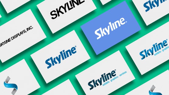
Throughout our history, the Skyline logo has evolved. This is to be expected and is a sign of a healthy brand that has been cared for over several decades. The first version was launched in 1980 and displayed "Skyline Displays, Inc." in a blue typeface. From there, the logo underwent several transitions and eventually added the iconic Skyline "S." Here is a visual depiction of the logo evolution.

Just as our competitive environments and clients evolve, so do brands. Over the past year, Skyline has been on the path of transformation. We have added many new leaders, acquired dealers, and launched BrandSync, a live events agency. But even in that transformation, the energy and vibrancy of Skyline remained.
Therefore, our brand needed to evolve too. With our refreshed identity, we want to celebrate our transformation while respecting our heritage. We want to firmly claim our leadership position while showcasing the energy of the trade show floor. We wanted a logo that worked as well on small screens and wearables, as it does on banners and exhibits. And we wanted a bright, energetic, friendly, adaptable visual – just like our people.
The letters – or wordmark—were augmented. We thinned the letters and tightened the kerning to modernize the visual appeal. We removed the dot over the "I" to increase legibility and dropped the registration mark to the bottom to ground the logo. The changes are small; the visual impact is much more significant. Simply thinning and kerning letters and removing a dot modernized the logo bringing it in sync with the current trend of streamlining graphic logos.

Outside In
When we set out to refresh the brand, we first reviewed data from client surveys and interviews to learn more about our clients and better understand how we were currently perceived. This research validated that we were focused on the right personas: marketing professionals. “Single source, great rental options, and custom modular” came up a few times. But we still needed more. We wanted to be unique and more contemporary to appeal to marketers.
Then, we looked at our competitors in the market and how we fit in to see if we could identify our differentiation. Finally, we partnered with a consulting group to help articulate our positioning. We developed a cross-functional team, and they led us through intense discussions on what makes us unique and what is valuable to clients. This is when it came together, and we began refining and articulating the benefits of our custom modular approach.
Skyline is your trusted partner in creating brand-elevating custom modular exhibit experiences.
![]()
Look & Feel Matters
When we reviewed the visual nature of the brand, as marketers who were new to the company, we saw blue and more shades of blue. Color plays a significant role in audience recognition and psychologically impacts consumers' moods.
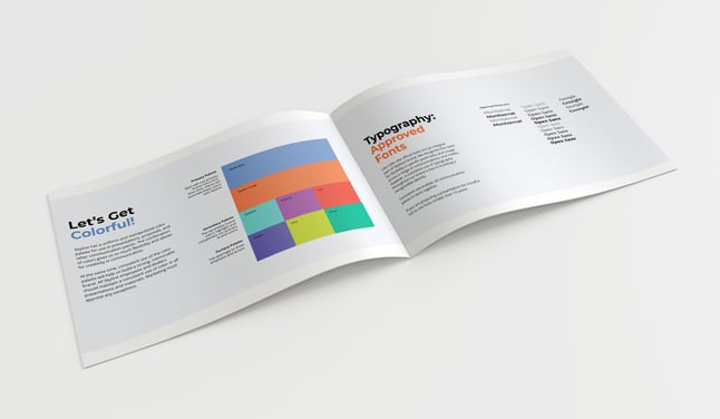
Psychologically blue presents trust and integrity – both positive features authentic to Skyline. However, without supporting colors the brand can appear static. We decided to keep some blue but add a vibrant color palette to reflect the energy of our people on the trade show floor.
Our softer and richer hue of blue nodded to the past while welcoming an array of vibrant colors provided us with modern energy and playfulness.

Artful Icons
If you’re a client of Skyline, you may already be familiar with the creativity of our team. Our designers create works of art. Our experiential team brings it to life in the booth.
Our inspiration for our icons was modern art, and our goal was to salute our talented team of artists while adding energy to the brand and tactically aiding in website navigation.
Letting go of the stock standard illustration and icons, we wanted an entire library that would work together and drive brand consistency. We wanted to convey a touch of modern art and use the icons to tell stories. Our brand refresh video shows how the icons can be animated to tell our story.
Skyline S Gets Colorful
Many of you are likely familiar with the Skyline S used in many marketing tactics. Our next step was to align it with our refreshed brand. We focused on linking to our prosperous past while providing a more energetic, modern touch that would appeal to marketers. We decided to make the Skyline S a dynamic, playful element that worked with our logo but did not replace our logo. With that in mind, we created a new Skyline S that showcased the entire color palette.
And, of course, all this is further defined by brand guidelines for employees, dealers, and vendors.
![]()
So, there you have it. We still have our heritage brand's strength, reliability, and trustworthiness, but we've had a little makeover. We are modern marketers with a keen eye on current trends. We partner with marketers to amplify their brand on the show floor through high-impact graphics on custom modular structures that can be reused, refreshed, and reconfigured.
Thank you for reading and keep watching as we bring our new brand to life!


