How to Enhance Trade Show Engagement Through Color Psychology
|
Learn how smart color choices help create memorable brand experiences and how color psychology helps you connect with attendees on an emotional level, making your booth stand out in crowded exhibition halls.
|
Getting attention at a trade show takes more than eye-catching visuals—it’s about using every design element with true intention. Nothing shapes first impressions or sparks curiosity quite like color. Color is that instant, emotional trigger—a cue that not only grabs attention but also helps your brand stick in people’s minds. If you know how to harness color psychology in your booth design, you turn drive-by glances into genuine interest and meaningful conversations.
Let’s look at what makes color such a powerful tool on the show floor, how you can choose the right palette for your brand, and real-world ways to use color to create a magnetic, brand-forward presence.
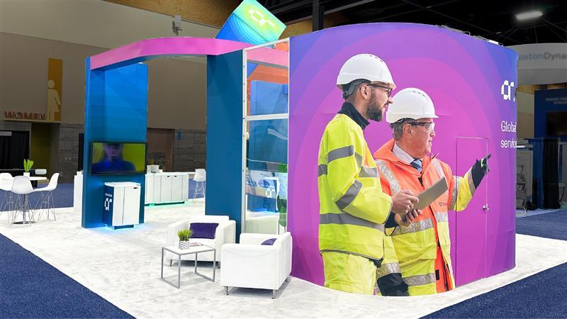
The Power of Color in Trade Show Booth Design
Color shapes how we feel and what we remember, far more quickly than we realize. From the first moment someone lays eyes on your booth, color is already working—setting the tone, communicating emotion, and nudging decisions. It’s not just about making things beautiful; color is a smart way to carve out a place for your brand among the competition.
What is Color Psychology?
Color psychology explores how colors affect human perception and behavior. Each hue naturally evokes specific emotions. When you select colors with those feelings in mind, you can reinforce your brand’s story, inspire trust, and help guide visitors through your space.
Common Colors and Their Psychological Effects
- Red: Red grabs attention and injects energy. It’s great for creating excitement or urgency. If you want to highlight calls to action, a dash of red can do the trick. However, it’s important to use it sparingly unless it’s a key brand color. If red is your signature color, let it shine across your booth! Used with purpose, it leaves a strong and memorable impression.
- Blue: Blue is calm, steady, and trustworthy. It puts people at ease and signals professionalism and, as such, is a go-to for brands that prioritize reliability, like tech innovators, financial firms, and healthcare providers. Blue also has a universal appeal, making it a safe yet impactful choice for fostering trust and confidence.
- Yellow: Yellow is all about positivity and enthusiasm. It lifts spirits and catches the eye as an accent, but use it thoughtfully—you want to brighten the mood, not overwhelm it. When balanced well, yellow can evoke feelings of happiness and optimism, making it a great choice for brands that want to inspire energy and creativity.
- Green: Green conveys growth, wellness, and balance. It’s especially effective for brands focused on health, nature, or sustainability. Beyond its natural associations, green also conveys a sense of renewal and harmony, making it a versatile choice for creating a calming yet engaging atmosphere.
- Black and White: Black radiates luxury and authority, while white keeps things crisp and straightforward. Together, they offer dynamic contrast and give your booth a polished, modern look. This combination is perfect for brands aiming to exude sophistication and clarity, ensuring your message is both bold and timeless.
How to Choose Colors for Trade Show Graphics
Choosing your booth colors isn’t just guesswork—it’s a mix of creativity and strategy. Here’s how to make sure your colors truly work for you:
Align Colors With Your Brand Identity
Your brand guidelines are the foundation that keeps your color choices true to who you are. It is recommended to stick with your brand guidelines throughout your booth. If you’re building your brand’s palette from scratch, start with a creative brief to use as your north star.
Next, look at your competitors. See what colors they’re using—not to copy, but to make sure your brand stands out. The goal is to differentiate, so don’t be afraid to be bold or unique.
Most importantly, think about your target customers. What grabs their attention? What makes them feel comfortable, inspired, or impressed? Let your understanding of their preferences shape your palette. Colors aren’t just about your brand—they’re about the people you want to connect with.
Remember: consistency is crucial. Use your chosen colors across every touchpoint—booth graphics, pre and post promotions, digital content, even team attire—for a brand look that’s memorable and cohesive.
Create Strategic Focal Points
Pick one main color to lead visitors to key areas, like where you’re introducing a new service or hosting an interactive demo. Accent colors help highlight supporting features and keep people moving naturally through your space.
Stand Out From the Crowd
On a busy show floor, subtle colors can blend in and be easily missed. Going bold with high-contrast combinations can help your booth pop and draw people in. Stick to two or three top colors, using others as accents; too many competing hues can make your key message get lost in the crowd.
Tips for Maximizing Trade Show Engagement with Color
Let’s make sure your color choices do more than look good—they should help you foster deeper engagement:
- Maintain Consistency Across All Assets From backlit graphics to digital displays and staff shirts, a coherent color scheme boosts brand recall and confidence. Consistency goes a long way in earning trust and leaving a lasting impression.
- Use Color to Guide Behavior Smart color placement helps direct foot traffic. Highlight interactive zones or spotlight your most important displays with intentional color choices that naturally lead visitors to you.
- Support Message Hierarchy Contrast is your friend when you want to draw attention to headlines, calls to action, or product features. A clear hierarchy keeps your messaging organized and easy to absorb, even in a fast-paced trade show environment.
- Test and Adapt Whenever possible, preview your color choices in a real, show-like setting. Lighting and surroundings can shift how your booth looks. Make tweaks to ensure your colors are on point and true to your vision. Pre-staging your booth is critical.
Current Trends in Trade Show Colors
Staying ahead of color trends can help your booth feel modern, relevant, and truly memorable. Here’s a look at some of the most popular color directions currently making waves on the trade show floor, along with why they resonate and practical ways to use them. Be sure that you are following your brand guidelines when considering color trends.
Vibrant Jewel Tones
Examples: Emerald Green, Sapphire Blue, Amethyst Purple, Ruby Red
Why Trending: These rich, saturated hues bring boldness and sophistication to booth designs. Jewel tones naturally convey luxury and command attention, especially when contrasted against metallic accents or neutral backdrops.
Use Case: If your brand guidelines allow for jewel tones, they work well for backdrops, signage, or statement displays when you want your booth to stand out in a crowded hall.
Earthy and Organic Neutrals
Examples: Terracotta, Sage Green, Warm Beige, Olive, Clay Brown
Why Trending: Drawing inspiration from nature and sustainability, these grounded tones are soothing and authentic. They appeal strongly to eco-conscious audiences and add a sense of approachability.
Use Case: Excellent as base colors for booth structures or wall panels, paired with brighter accents to create visual interest without overwhelming.
Soft Pastels with a Modern Twist
Examples: Blush Pink, Mint Green, Lavender, Powder Blue
Why Trending: Modern pastels bring a fresh, welcoming feeling—no longer just sweet or childlike, but contemporary when combined with bold contrasts or gradients.
Use Case: Use for accent areas, banners, and digital content to add a friendly yet chic vibe and invite visitors into the space.
Bold Neons and Electric Hues
Examples: Electric Blue, Neon Coral, Acid Yellow, Hot Pink
Why Trending: Driven by digital, tech-forward branding, neons energize your display and are hard to ignore. These shades align especially well with companies aiming for an innovative or youthful image.
Use Case: Ideal for tech-focused shows or to draw attention to new products and key messages with vibrant lighting and signage.
Metallic and Iridescent Shades
Examples: Gold, Silver, Chrome, Pearlescent White, Holographic Tones
Why Trending: Metallics add depth and a premium quality to any booth, playing with light and giving off a sense of modernity or high value.
Use Case: Incorporate logo treatments, borders, or interactive design elements to convey luxury and draw the eye.
Monochromatic and Tonal Palettes
Examples: Variations of Blue (Navy to Sky), Green (Forest to Mint), Gray (Charcoal to Silver)
Why Trending: These schemes create a sophisticated, cohesive look, ideal for brands wanting a seamless and professional appearance. They’re easy to coordinate, helping reinforce brand consistency.
Use Case: Layer different shades within the same color family for backdrop graphics, furniture, or signage to build depth and harmony throughout your booth.
Warm Sunset Hues
Examples: Burnt Orange, Golden Yellow, Coral, Dusky Pink
Why Trending: Inspired by the beauty of sunsets and natural lighting, these shades evoke positivity, warmth, and creativity. They create inviting environments people want to linger in, crossing genre boundaries from wellness to tech.
Use Case: Use these colors for backdrop walls, lounge areas, or accent graphics to create a welcoming, engaging atmosphere.
Designing With Purpose Pays Off
At the end of the day, using color thoughtfully isn’t just about looking good on the show floor. It’s about helping people notice you, trust you, and want to learn more. When every color serves a purpose, you create a space that attracts, persuades, and leaves a memorable mark—even after the event is over.
About the Author
Morgan Fletcher
Graphic Designer, Skyline Exhibits
Morgan Fletcher is an award-winning creative professional with more than 20 years of graphic design and branding experience, including nearly a decade specializing in the live events industry. She has demonstrated success in corporate branding, concepting and executing creative campaigns for international brands and is experienced across a wide range of tactics.


